Of the many hats I had the pleasure of wearing as Vorbi’s Creative Director, the very first one I tried on was the ui/ux cap. Since I was responsible for the company rebrand, you could say I put the branding hat on as well. A hat I would keep on for every creative project while building the new image/style.
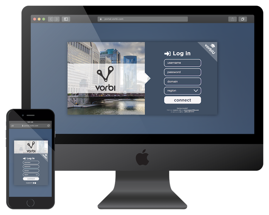
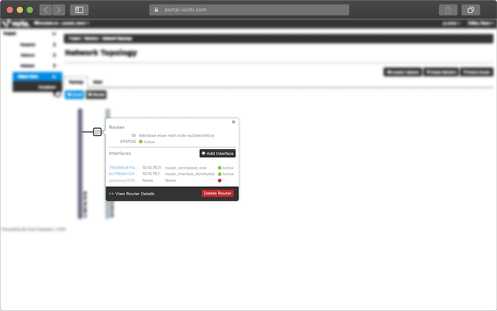
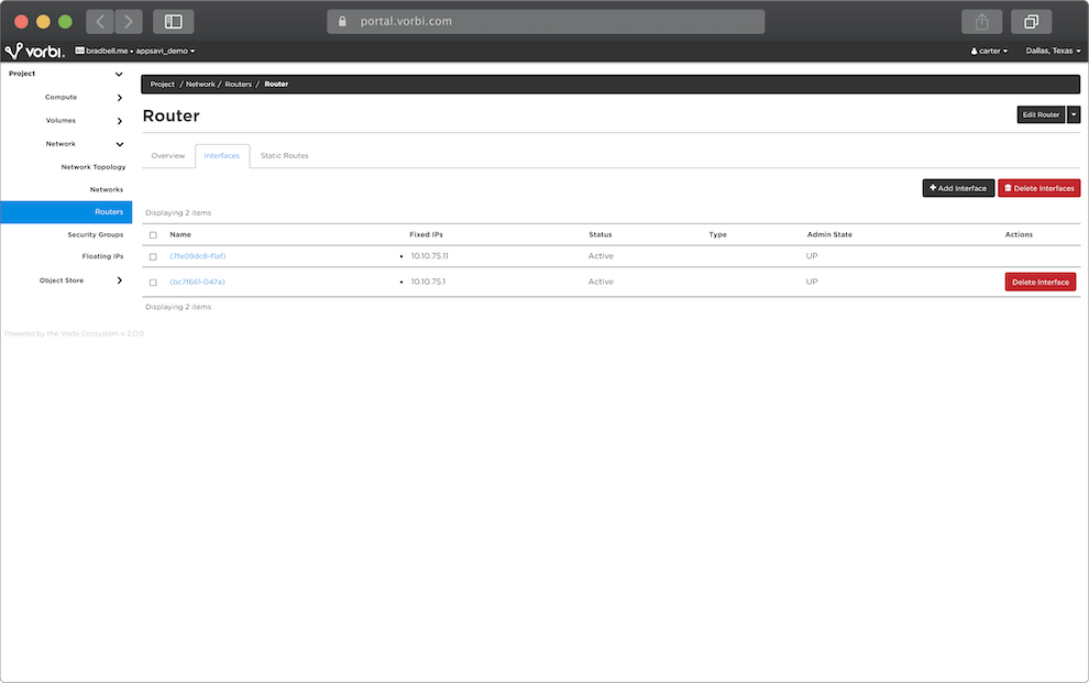
Vorbi had just finished back-end programming on its V2 Platform that was due to be released in three weeks. To accompany this new release, I was to redesign the portal starting with the login screen to ease customer usability and improve its visual appeal. Now in charge of the new face of a very minimally branded company, I was given full creative freedom and told tomake it my own and make it sick!
APPROACH
As a seasoned singer-songwriter & recording artist, I developed a very thick skin throughout my musical career that I wear during all of my creative works; constructive criticism is paramount in my creative process. That being the case, I usually like to mock-up between 3 and 5 completely different concepts to run by my client. Once they pick a winner, I hit the ground running—creatively—in that direction!
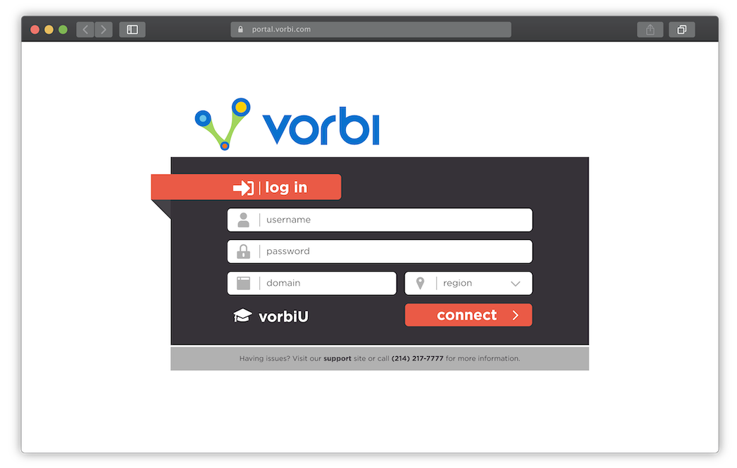
original login screen
// Of those five, I presented three, and of those three, the client chose one
// fun fact
ACTION
At this point, having knocked out and checked off the few requirements initially provided to me—ensure that the previous buttons continue to follow their respective links—I now had a basically blank canvas on which to paint. I seized the opportunity to select some new colors, a brand new font family, and some slick new imaging that illustrated the corporate professionalism that I was aiming for.
EXECUTION
Once given the green light to proceed with the design, I added some bells and whistles, created the mobile version for responsivity, and then set up a meeting with the dev team to explore the most effective way to bring this design to life.
OBJECTIVE
DELIVERABLES
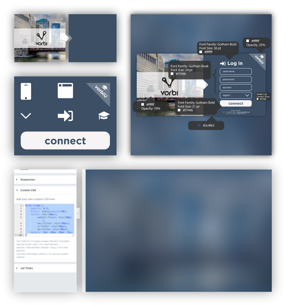
As I am very attentive to detail and thorough with my design work, I left the meeting with a list of deliverables and a concrete plan to communicate the information through detailed ‘instructional PDFs’ to make the job easier on the dev team.
CURVE BALLS
In my experience when a project is coming along particularly well, it isn’t uncommon for new ideas to be handed down for incorporation. This project was, and some ideas were. The request was for alternating color options for the portal background, so I carefully crafted seven more that would mix well with all of the other elements remaining static.
// something awesome
// RINSE AND REPEAT
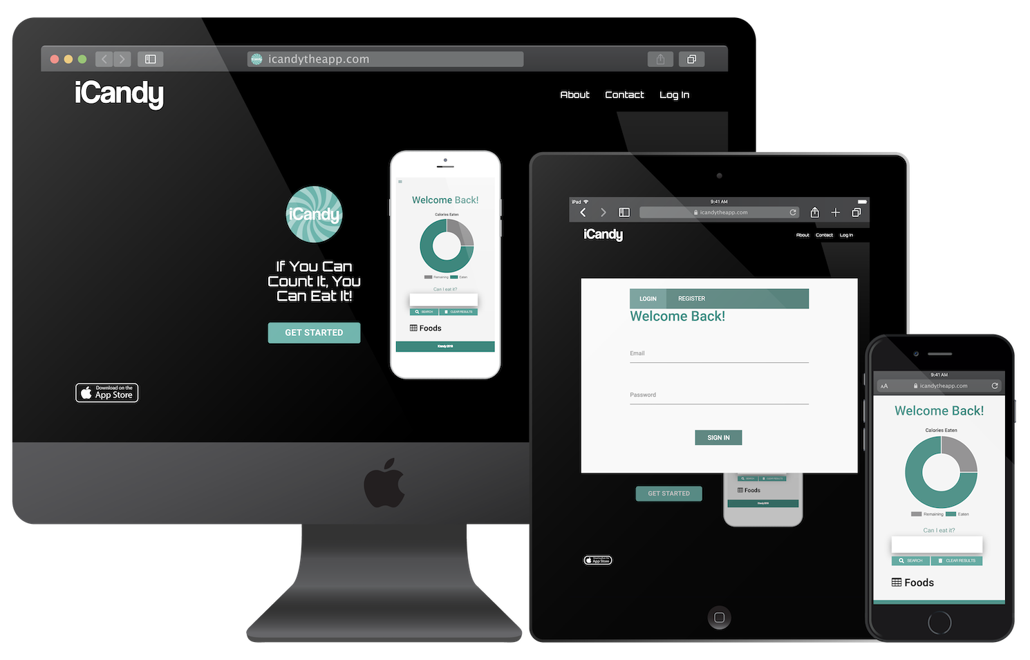
candy & calorie app
iCandy
iCandy is an app I designed to count calories and determine for its users how much candy they could eat per day while still staying fit.